I’m excited to share my collaboration with Milk Branding, where I was commissioned to design the key visuals for Attica Department Stores‘s Mother’s Day and Father’s Day campaigns.


Both pieces were developed together from the start, even though they launched a month apart. The campaigns ran across digital and in-store, so they needed to work in a lot of different formats and still feel like one thing. It was a great opportunity to work with Milk on a project for such an iconic retailer in Athens.
The starting point
Milk Branding had already worked out the concept and the message, so I had a clear foundation to build on.
The main goal was to keep things minimal and elegant. Something that would feel aligned with Attica‘s identity, without getting too decorative or busy. The message needed to stay front and center, for both pieces.

The proposals also had to be close to final from the start. So every direction I worked on had to be properly thought through, not just a rough sketch.
Letting the lettering do the work
Given all that, a typography-led solution felt like the natural fit.
I wanted the message itself to be the main graphic, not something illustrated around it. Custom lettering gave me room for personality while keeping things clean and controlled.
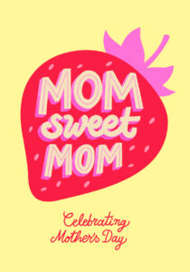
MOM Sweet MOM
The Mother’s Day piece is built around the phrase “MOM Sweet MOM,” lettered in a way that also forms the shape of a cupcake. You read the message straight away, and the “sweetness” part reveals itself a little after.


Cool DADDY Cool
The Father’s Day piece, “Cool DADDY Cool,” was designed as a companion to the cupcake. This time the lettering sits inside a chocolate-dipped popsicle.
Same visual language, but with more of a summer feel, since it launched in June.
Design process
I went through a few directions on each piece, playing with structure, weight and composition as well as different shapes.
Early sketches were about making the lettering carry both the message and the shape (cupcake, then popsicle) without it turning into an illustration. I struggled with not making it too literal, keeping the shapes simple and abstract enough to just suggest the cupcake or the popsicle, rather than draw them in detail.



——-


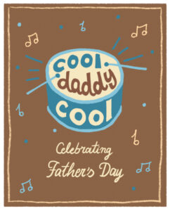


The two pieces needed to read as part of the same family while each keeping its own personality. From there they turned into a system that could hold together across a lot of different sizes and formats.
Where it ended up
The most interesting part was seeing both visuals translate across so many formats, in the same way.
On digital, each campaign was adapted for:
- Social media posts and stories
- Alternative story formats (like gift ideas)
- The website homepage
- Newsletter assets, including a bonus animated version
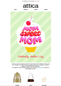
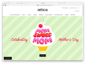


🔗 See all the Mother’s Day digital applications here.
🔗 See all the Father’s Day digital applications here.
——-
In store, they extended into:
- Digital screens
- Die-cut shelf talkers
- Escalator stickers

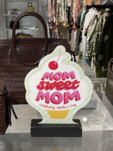


🔗 See all the Mother’s Day in-store applications here.
🔗 See all the Father’s Day in-store applications here.
The escalator version needed a horizontal adaptation of the whole composition, for both pieces. It showed how the lettering system could adapt while maintaining its identity.
The shelf talkers were especially present throughout the store each time, which made seeing the designs everywhere even more fun.


Collaborating with Milk
Both projects were developed closely with Milk Branding, who led the overall direction, rollout and final applications.
Having that clear structure to work inside meant I could focus on getting the lettering right, knowing it would integrate into the bigger campaign.
What I took from it
Projects like this are a good reminder that lettering can carry a whole campaign on its own. Not just decoration, but the actual message. And that two pieces can share one visual language while each still having something to say.
It was a pleasure to work on these for Attica and to see them out in the world, on screens and on the shop floor.
🔗 You can view the campaign on Attica‘s Instagram here.